
Kunskapskanalen
Looks and smarts
Swedish public service documentary and science tv channel Kunskapskanalen was longing for a complete redesign. The new identity exudes self confidence and invites the public to explore a curious and curated universe of fact based content. The new look stems from functional design, where the classic pegboard has been reinterpreted as a modern and welcoming dot grid for structure and guidance. The logo bares resemblance to its heritage yet is complimented and refined in its unique double K. In collaboration with OXYS the brand new branding was also manifested through a new website.
Awards
red dot 2019
winner, Brands & Communication Design
The one show 2020
Shortlist
Our Assignment
Visual identity
Motion design
2D animation
3D animation
Motion templates


The new identity stems from functional design, where the classic pegboard has been reinterpreted as a modern and welcoming dot grid. Kunskapskanalen’s factual content is accentuated by a rich primary color palette, that allows for great variation and categorizing - including Day and Night mode. The font of choice is Baton Turbo, a perky sans serif with high legibility.


“We poured so much love into this multi-layered creature, making a strict system fun and accessible by blending rational design with 3D and giddy animations, I am so happy that this rebrand is acknowledged by an international design community”
Anders Johansson, Creative Director
-
![]()
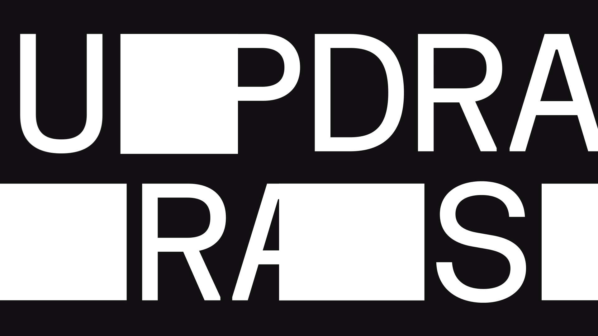
All caps, no secrets
Never afraid to ask the hard questions, peeling off layers of smoke and mirrors, Sweden's number one investigative show Uppdrag Granskning is stepping into a new, more versatile outfit.
-
![]()
Long live Melodifestivalen
From vintage iconic logo to live show graphics, to new iterations of iconic logo, to sudden bursts of glitter, to brassy awards, to smooth wipes, to gleeful guidelines and custom dust — we take Melodifestivalen’s branded ride through the decades very, very seriously, safeguarding the brand's integrity as the biggest live broadcast event in Scandinavia.
-
![]()
Dedication, courage and type
In search of the polished timelessness the highest global diplomacy demands, we opted for a restrained design to frame an extraordinary story, leaving the screen open for grander characters.
-
![]()
The power of looking cheap
The joy of reading is for everyone. The value of design is indisputable.
-
![]()
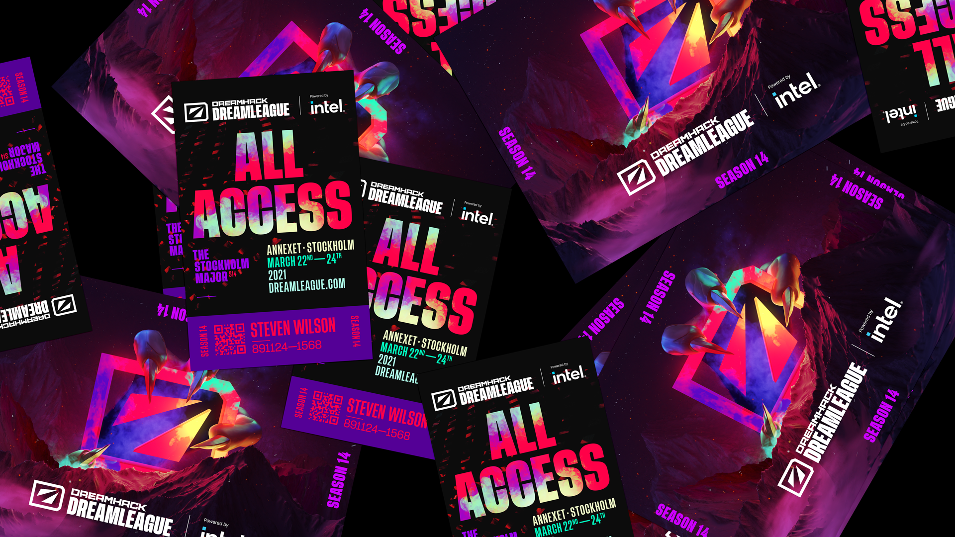
The dust never settles
The new DreamLeague identity is made to move, celebrating DreamHack’s remarkable 25 year devotion to bringing people together to play and create.