SVT
Uppdrag Granskning
All caps, no secrets
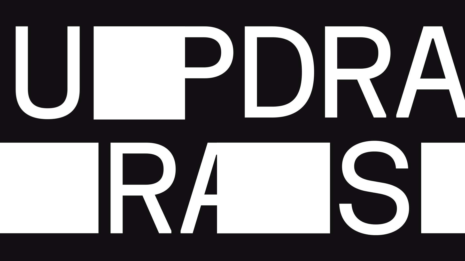
Never afraid to ask the hard questions, peeling off layers of smoke and mirrors, Sweden's number one investigative show Uppdrag Granskning is stepping into a new, more versatile outfit. In this careful rebrand we had two jobs: Making the identity elevate the reporting in new ways, as well as ensuring a consistent look across all screens. At the centre we put the act of unveiling the truth, making sure retracted information is unmasked and investigated. This is manifested through the graphic transition from image, to coloured masks, to shreds, to open image again.
Awards
guldägget 2024
silver, identity design
GEMa AWARDS 2024
Gold, TV/Streaming Europe: TOTAL PROGRAMME DESIGN PACKAGE
Red dot 2024
best of the best
Svenska designpriset 2024
Gold, visual identity
Peoples choice, film info/culture
best in show
Cresta Awards 2024
shortlist
Our Assignment
Visual identity
Motion design
2D animation
Motion templates


A new design element was introduced: The Search Lights. The two squares are a representation of the search for truth. In this iteration of the identity they are shedding light on shadowy parts of society. The simplicity of this design asset opens up an abundance of opportunity as a catalyst for animation, unmasking images, opening and closing overlay graphics and directing attention. If this branding were a band they’d definitely be on the drums.

The new Uppdrag Granskning logotype is a stable and clear cut name tag when fully formed. On its way there, it unveils different pixels at a time, making visible what was concealed. Bright yellow is the primary logo color, backed by a palette of reds, greens, and pinks, helping with highlighting and categorization on and off air.

You are obviously wondering about the type. Yes, we chose FK Display as the main type — a sophisticated and serious font, with its own flavor. It is used for all headlines, shorter texts and overlay graphics, always in caps. Longer pieces of copy are set in Inter for increased legibility. The typography as a whole is dressed for a serious conversation, but also adding a little bit of zing to certain glyphs, for recognisability.
In the truth-business, it should never be unclear what is branding and what is content, that’s why the graphic packaging is so clearly separated from people, places and images in this case.
Charlotta Ribbefjord, Brand Strategist


All caps, no secrets. Never afraid to ask the hard questions, peeling off layers of smoke and mirrors. Sweden's number one investigative show, Uppdrag Granskning, stepped into a more versatile outfit last year.
At the center, we put the act of unveiling the truth, making sure that retracted information is unmasked and investigated. This is manifested through the identity's core elements. The two graphic squares represent the search for truth — we call them the “search lights.” The clarity, simplicity, and flexibility of this motion identity highlight the eloquent content at hand, with no compromise to the obvious brand print.
The Dallas team is humbled and honored to have reached the hearts and minds of this year's jury with our work for Uppdrag Granskning — Awarded "Red Dot: Best of the Best" in the Brand Design & Identity category of the 2024 Red Dot awards. Dear Red Dot, we are simply over the moon!


